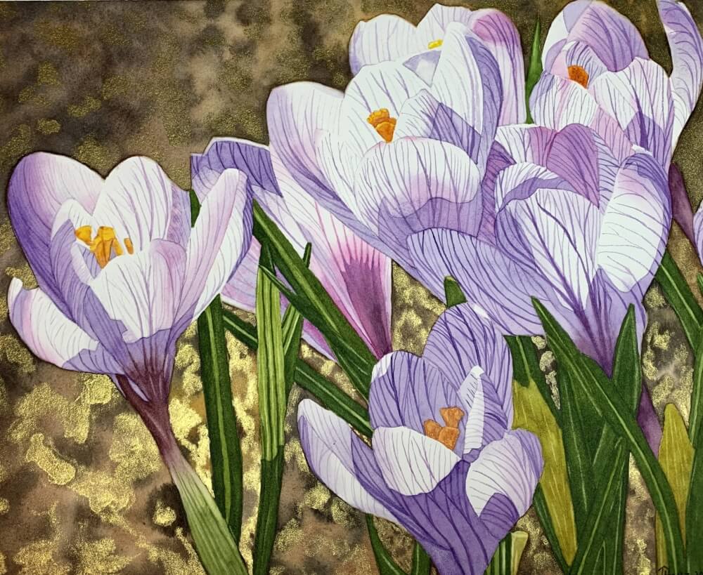
I painted this on Winsor & Newton 140 lb. CP paper. I was a bit disappointed with the vibrancy of the paint colors. It all dried a bit dull. I didn’t have any Arches on hand the correct size, so I opted for the W&N paper. I also decided to go rogue on the background with something I’ve been thinking about trying for awhile, and I thought this would be the perfect time to try it. After the first 2 washes were finished, I applied W&N gold metallic ink. I took the picture at an angle so that the shine would show. Fun effect I think.
Beautiful! The light shining through the petals is lovely.
Lovely!
Terri you have a very hand with pain, your lines are beautifully done. OMG the background is fabulous, stunning effect. Colors don’t look dull to me – do you think it was the brand of paint? or the paper? What colors did you use for the violet mixes? Ceci
Thank you Ceci for your sweet comments! I’m pretty sure the dullness was the paper. I never seem to have that outcome with Arches. I’ve also painted on Canson Heritage and have mixed results. I loved the paper when I first tried it, but even within the same block of paper, I got uneven and different results. Really strange. It’s an expensive paper too!
My purples were a combination of Daniel Smith Ultramarine Violet (a granulating color), Winsor Violet and Quin. Pink.
The petals are so translucent—lovely!