

My old palette
My favorite palette has always been Mijello with 33 wells. It’s a folded, plastic palette that is really lightweight and can hold all of my colors. It has a big mixing space, which I don’t really use because I mix my colors on all sorts of ceramic plates. However, that mixing area comes in handy when you travel with this palette, so it’s great it’s there.

Mijello palette with 33 wells
What I was looking for
I noticed that with time I’ve been using fewer colors. 33 colors on my old palette are A LOT, but in fact, I use maybe a half of them. Recently, I’ve been using only my top 12 colors. I thought I didn’t need a palette that holds 33 hues if I use half of them. I’ve been looking for a new palette that would fit my needs:
- It should hold around 15 colors;
- It should have a nice mixing space so that I don’t have to use additional plates;
- It should have a cover to protect paints from dust;
- It should not be too big.
I have a big American Journey Cavalcade porcelain palette, but it is huge and heavy. It has 30 wells for colors, and it measures 11″ x 16″ (28 x 41 cm). It is just too big for my purposes. I needed something smaller, with fewer wells, but still big enough to look good in my tutorials.

American Journey Cavalcade porcelain palette
New palette
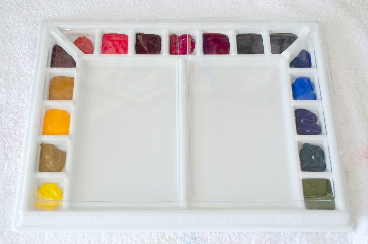
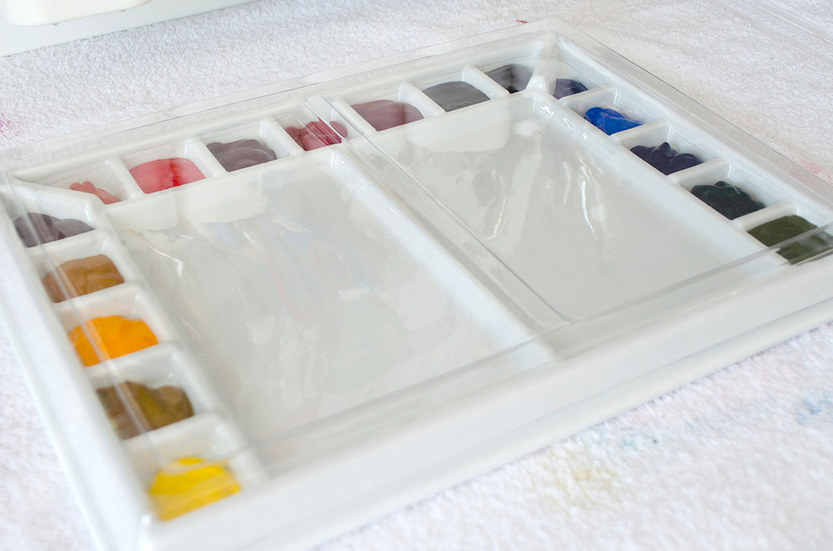
I’ve been researching for a long time to find something that would suit me best. Finally, I ordered a smaller version of the American Journey Cavalcade. It’s called Sojourner Porcelain Palette. It measures 9″ x 12″ (23 x 30 cm) and includes 17 wells for color, which surround two large 4″ x 7″ mixing areas.
I thought the size was perfect, and it had everything that I needed. The palette can be ordered at Cheap Joe’s (US), Jackson’s Art (UK), and probably on Amazon.

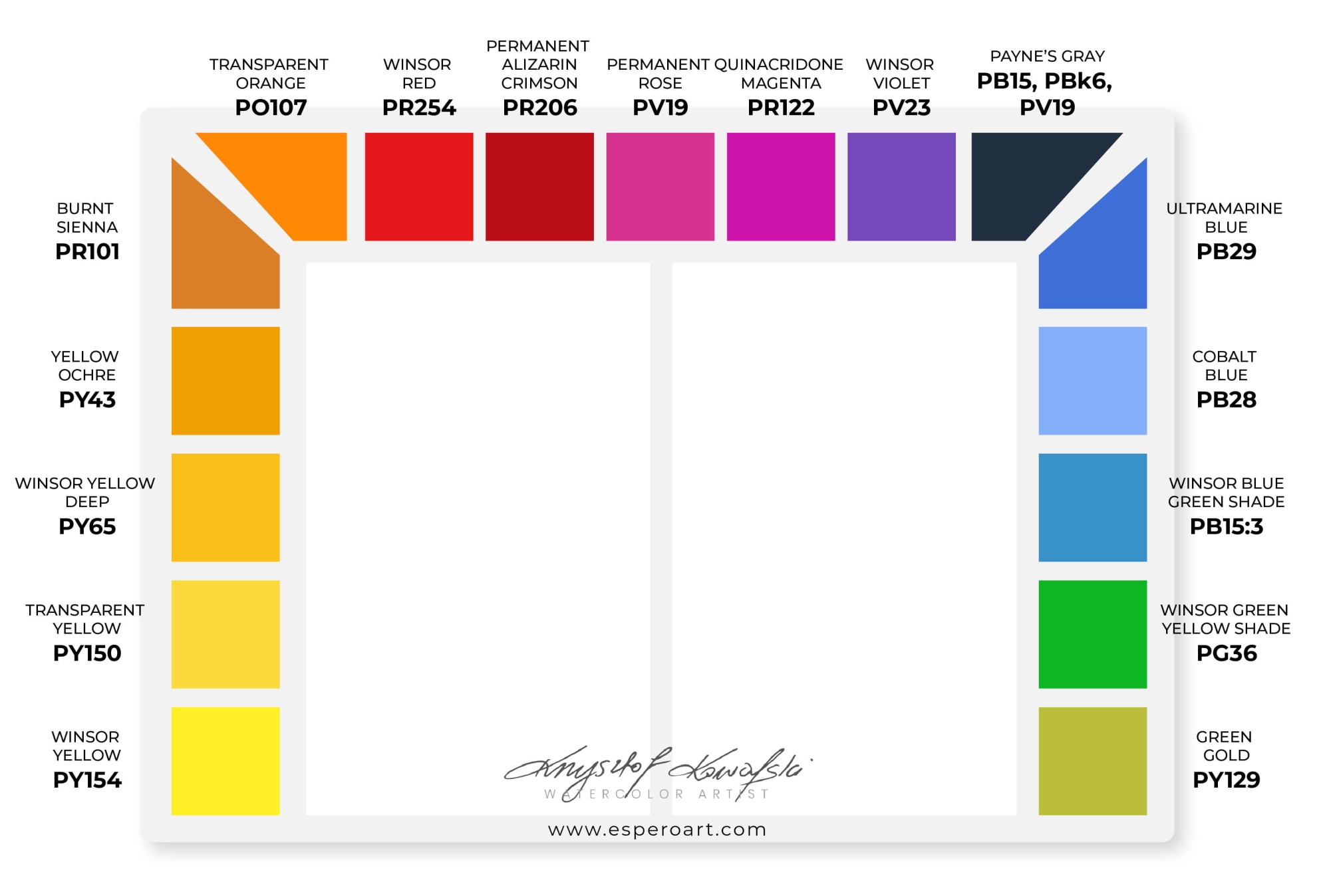
Sojourner Porcelain Palette
Helpful swatches
Setting up a new watercolor palette is one of those situations when color swatches come in handy. Before choosing colors for this palette, I played around with the swatches. They helped me not only to select the colors, but I could also arrange the colors and think which arrangement would be best.


Color choice
I knew that I must have my top 12 colors in this palette. However, the palette has 17 wells, and I don’t like to leave empty wells, so I had to select 5 more colors. I was sure about 2: I wanted to include two greens: Green Gold PY129 and Winsor Green Yellow Shade PG36. There were still 3 spaces. I thought, since green is a complementary color and I don’t have complementary colors in my set, I would add orange (Transparent Orange PO107) and violet (Winsor Violet PV23). I thought it would be nice to have ready-made complementary colors. Why not. I decided to add Yellow Ochre PY43 in the last free space.
Note 1: I use Winsor&Newton paints. One of the exceptions I used from a different brand was Translucent Orange PO71 from Schmincke. That is a beautiful warm orange. However, I wanted to keep the paints from one brand this time, so I thought I would use Transparent Orange PO107 by Winsor&Newton. Schmincke’s orange is brighter and warmer compared to W&N’s. But I thought I would give it a chance. I don’t use a ready-made orange a lot anyway, so it shouldn’t be a problem.
Note 2: I may replace Ultramarine Blue with Ultramarine Finest by Schmincke Horadam in the future. Ultramarine is a wonderful one-of-a-kind color. It’s hard to find a similar alternative. However, most Ultramarines are granulating. I can’t say I’m a big fan of granulating colors. If I have a choice, I prefer non-granulating ones. Schmincke’s Ultramarine Finest is known as the least granulating ultramarine blue. I still have a lot of W&N paint, but when I run out of it, I may go for Schmincke’s version.
Here you can see how I arranged colors in the new palette. I hope it will be comfortable to work with this palette. I can’t wait to use it for the first time!

A cover
This palette comes with a plastic, transparent cover. Exactly the same that comes with the big American Journey Cavalcade palette, so I knew what to expect. This cover turns yellow after a while, which doesn’t look attractive. However, I don’t mind that. It’s just a cover and its role is to protect the paints from dust. I’ve seen a nice idea of making your own cover with a foam board. I’ll think about it if I can’t stand looking at the original one :)
How much paint
I know there are many different opinions on how much paint you should squeeze into the wells. I fill the whole space. I don’t squeeze just one small blob because I know I will need to refill the well again, so I don’t see the point. Paints will dry no matter how hard we try to keep them moist, but that’s not a problem at all because watercolors are reusable. Before painting, I always spray the paints with clean water, and they are ready to go even after a year. The wells in the new palette can easily take a small 5ml tube of paint, and that’s the amount I put into the wells.


Hi Krys
Thank you, very interesting. Indeed, about a month ago I created my new palette [with 17 wells] and after much research, looking at several other artists, I adopted the colours inspired from your “Colour wheel, top 12 colours” – was in last October – and added a few to make up my 17. All my adopted colours are transparent except for Cerulean Blue and Yellow Ochre.
Interestingly, now looking at your new 17 colour palette today, mine is very very similar and am glad to have followed your initial path. Thanks again and congrats on your new palette.
Cheers from down under.
Hi Guy! Interesting to hear about your color choices. I really like Cerulean Blue, but I wish it was less granulating. I think I would include it in my palette if it wasn’t so granulating. Happy Painting!
This is crazy good! Thank you! I have to find your color wheel..thank you for being a great educator of watercolor!
You’re most welcome, Sue, and thank you! I’m glad you’ve found it helpful 🍀🌷😊
I also support Ukraine!
Thank you for sharing your palette journey.
Your paintings are spectacular and one day I will join your classes.
You’re very welcome, Linda! You’re always welcome to join us whenever you like. Happy Painting! 🍀🌷😊
Hi.
All watercolour artists ought to invest in a porcelain studio palette. I went though for one without any mixing space, because I prefer to mix my colours on white bathroom tiles which are made by enameled ceramic. And that because they are portable and I can wash them in the sink ( or even in the dishwasher) and I can have a much mixing space as I need. If I hate something is to have to clean my mixing space while I’m painting.
Regarding the choice of colours I think that is a mistake that you replaced the PO71 with an alternative Orange because PO71 is IMHO the ultimate mixing colour. It mixes grays, browns, and beiges with the blue colours and a super chromatic black if you mix it with PB60. It can also brighten any deep red like PR264, it is great to mute bright greens. It is a transparent alternative for Scarlet Lake PR188, a bit more brighter than PR207 and potentially ( depending the other colours of your palette), PR254 and PR209. If you don’t have access to the Schmincke one it is available from Rembrandt line as well. Same pigment, same hue, same mixing properties.
My colour selection now is similar to yours but I prefer as my Lemon Yellow the PY184 by VG that is semi transparent.
I use also PY150, PY129 ( a stable in my palette), Gold Transparent Ochre that I make it in watercolour myself from raw pigment that is a PY43, the PO71, PR264, PV19 Q. Rose, PR122, but no PV23 because it is not always that lighfast and it can be mixed easily.
In its place I use PB60 Intanthrene Blue that mixes easily very dark Greens and blacks, PB29, PB28, PB15:3, PG7 ( because it is the ultimate mixing colour), PV14 Cobalt Violet and always the V.G R.Umber Hue that is a mix of PR101/PY42 as it is the ultimate neutralizing colour and the best for mixing skin tones.
Finally I use Transparent Red Oxide PR101 by Rembrandt as an alternative to W&N B. Sienna because it is more transparent and deeper… anyway I like it more and as a darkener my own made/mixed Neutral Tint that is an 1:1 mix of PR264 and PG7.