

My thought process when choosing yellows
Ever wondered how I decide on the yellows for my watercolor palette? Whether I’m creating a new color scheme or eyeing a new yellow paint on the market, here’s a peek into my thought process.
- Firstly, yellow is a primary color, and since I use a split primary palette, I aim for at least two yellows: a warm one and a cool one.
Now, which yellows do I use in watercolor painting? This is a common question I receive, so I thought I’d dive into it more thoroughly in this post, focusing on Winsor&Newton (WN) paints as my base (I use this brand). For those using Daniel Smith (DS), I’ll make comparisons. If you have a different brand, check out my conversion chart on this page under the Paints section: CLICK.
Now, keep in mind that this is my personal approach, and what works for me might not work for you.

I’ve got quite a collection of yellows, organized into four groups within the Winsor&Newton brand. Let’s break them down:
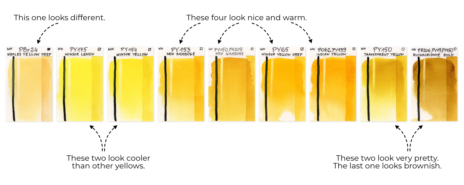
2. So I have 4 groups of yellows in Winsor&Newton (WN) brand. In this presentation, I’ll be including examples from Daniel Smith (DS) along with Winsor&Newton (WN). Please note that I have swatches of colors from both brands, but it doesn’t cover every single color—they’re based on what I have available. Let’s dive into the comparisons!
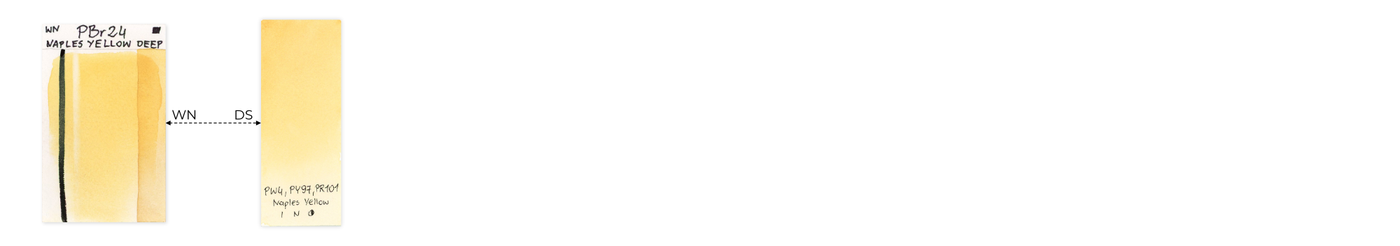
Different Yellow: Starting with the unique Naples Yellow Deep PBr24 in WN, its closest match in DS is Naples Yellow PW4, PY97, PR101.
Cool Yellows: Sorting through my cool yellows, I discovered similar options in the DS brand, forming the second group.
Warm Yellows: The third group consists of my warm yellows, with DS offering many alternatives in this category.
Slightly Dirty Yellows: Lastly, we have a group of yellows with a bit of a twist. DS has options in this category too, making up the fourth group.
Now, here’s a crucial question to ask yourself: When looking at a group, do you really need ALL those yellows? They might appear similar, but you probably don’t need every single shade. Manufacturers create a variety of colors, and while it’s good for business, it doesn’t mean you need them all. Save your money by choosing only the colors that truly work for you.
So, how do I select the best colors for me? Here’s my approach:
CONSIDERATIONS WHEN CHOOSING COLORS FOR MY PALETTE
Using a split primary palette, I recognize the importance of having one cool yellow and one warm yellow as essential components. These become my must-haves. Other colors, while nice additions, are not as crucial to the foundation of my palette.
Here’s what I take into consideration:
- Single-Pigmented Colors: I prioritize single-pigmented colors. Although names may vary across brands, looking at the pigments helps identify similar shades. My palette mostly consists of single-pigmented colors, except for Payne’s Gray, which adds a touch of complexity.
- Opacity: I prefer transparent colors, so if a color is opaque, I approach it cautiously. My preference is for semi-transparent or semi-opaque colors if a good transparent alternative isn’t available. If needed, I’ll reluctantly choose opaque colors.
- Lightfastness: Ensuring lightfastness is crucial to prevent colors from fading over time. Fortunately, most modern paints have excellent or very good lightfastness. Some exceptions, like Aureolin PY40 and Alizarin Crimson PR83, have lower lightfastness. Colors with added fluorescent dyes, such as Opera Rose PR122, BV10, or Bright Violet BV15, BV7, need extra attention. While these colors can be used, artists should be cautious about potential fading over time.
- Granulation: I lean towards non-granulating colors, given the choice. Non-granulating colors suit my preference, providing a smoother appearance in my paintings.
- Personal Preference and Usage: Finally, I consider whether I genuinely like and use the color in my paintings. There’s no sense in dedicating space on my palette to a color I rarely use or don’t enjoy working with. For instance, Naples Yellow doesn’t serve me well in my artwork. I find it more suited for painting architecture, landscapes, or perhaps portraits. Similarly, Cobalt Turquoise Light, although a beautiful color, only makes its way into my work about once a year. Rather than keeping them on my palette, I simply squeeze out a bit when I need to use them. This way, I make room for colors that I use more frequently.
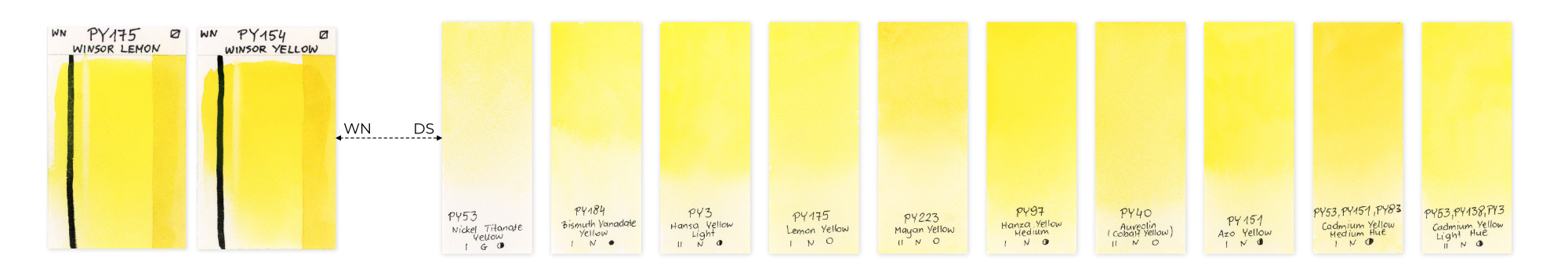
COOL YELLOWS
Now, let’s examine the range of cool yellows and walk through my elimination process.
I know, based on color theory, that the coolest yellow tends to be something like lemon yellow, leaning towards green on the color wheel. Within this group, we have Winsor Lemon, Nickel Titanate Yellow, Bismuth Vanadate Yellow, Hansa Yellow Light, and Lemon Yellow.
However, drawing from my experience, I already know that I don’t use this particular shade of yellow. It’s too cool for my preferences, and I rarely find it necessary in my work. Even if I were to paint a lemon, I’d opt for a slightly warmer yellow, which I can always cool down by adding a touch of blue. As a result, I can confidently eliminate these five colors from consideration at this stage.
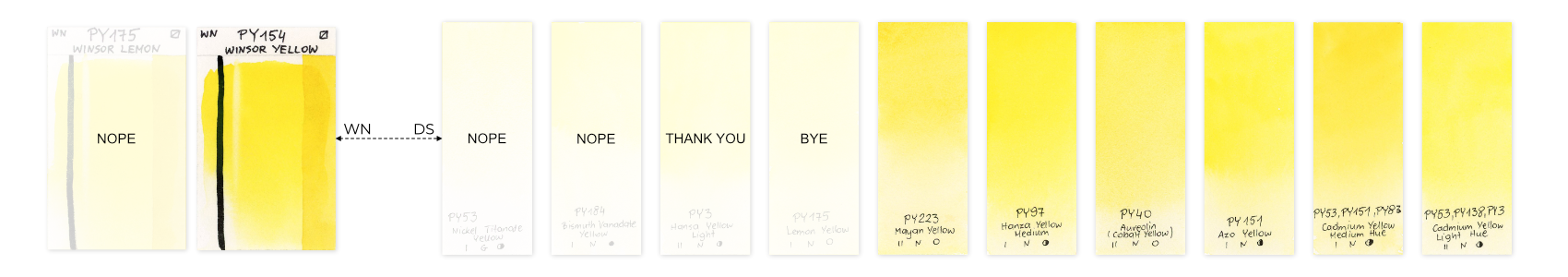
Upon closer examination, the remaining options seem quite similar. In my preferred brand, Winsor&Newton (W&N), I already have a clear winner: Winsor Yellow PY154, which I’ve identified as my cool yellow.
Now, the question is: what about Daniel Smith (DS)? Let’s explore their offerings.
Narrowing down the options for Daniel Smith (DS), I’ve made some choices:
1. Aureolin: Eliminated due to being a fugitive color.
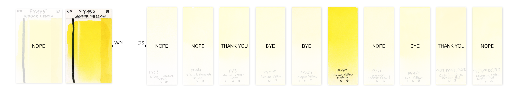
2. Cadmium Yellow Medium Hue and Cadmium Yellow Light Hue: Ruled out because cadmium colors are both toxic and opaque, and these specific ones are not single-pigmented.
[UPDATE] A big thank you to Melissa, a reader of this blog post, for highlighting that Daniel Smith’s Cadmium Hues colors are NOT toxic. According to information on Daniel Smith’s website:
“DANIEL SMITH Cadmium Hues, which began production in 2000, are better and safer than the old Cadmiums – with increased opacity, greater vibrancy (brighter chroma), and none of the potential toxicity. They’re called “hues” because they are made with alternative pigments instead of Cadmium metal compounds.”
They even mention that:
“They’re called “hues” because they are made with alternative pigments instead of Cadmium metal compounds. These pigments are manufactured with a process called co-precipitation, which means they are essentially single pigments, even though they’re labeled with what looks like more than one pigment.”
This sounds a bit odd to me: single pigments but not single pigments :) Anyway, thanks to Melissa, we now know that Cadmium Hues from Daniel Smith are not toxic. Thank you, Melissa!
Taking into account this new information, Cadmium Yellow Hues become a viable option.
This leaves us with three contenders: Mayan Yellow, Hansa Yellow Medium, and Azo Yellow.
Mayan Yellow: Eliminated due to inferior lightfastness and a less vibrant appearance.
Now, we have Hansa Yellow Medium and Azo Yellow left. Both share similar properties, but upon closer inspection of my swatches, there’s a subtle shade difference. Azo Yellow is cooler than Hansa Yellow Medium. Consequently, my choice for the cool yellow in the Daniel Smith brand is Hansa Yellow Medium PY97.
So, in summary, my cool yellow in Winsor&Newton is Winsor Yellow PY154, and in Daniel Smith, it’s Hansa Yellow Medium PY97. Despite being from different brands, they appear very similar.
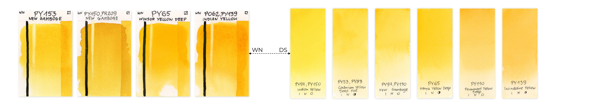
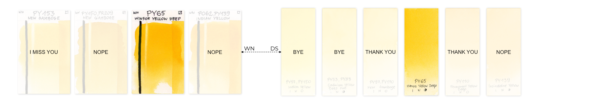
WARM YELLOWS
Not to worry if you’re feeling a bit fatigued—art demands a bit of sacrifice, doesn’t it? 😊 Let’s keep going and delve into the world of warm yellows!

One of my all-time favorite warm yellows was the beautiful New Gamboge, crafted with the PY153 pigment, giving it that gorgeous, sunflower-like warmth (the first one on the left). Regrettably, this pigment is no longer available, and producers have introduced alternatives. Winsor&Newton’s version now uses PY150 and PR209, while Daniel Smith’s version is crafted with PY97 and PY110. They may appear somewhat similar, but for those of us who loved the original PY153 pigment, there’s just no perfect substitute.
Many artists, myself included, have shifted to pigment PY65. While on swatches and screens, it might resemble the original, in reality, it leans more towards yellow-orange. Some have also tried Permanent Yellow Deep PY110, but it, too, tends towards orange and lacks that true yellow hue. In comparison, PY65 is more yellow-orange than PY110. There’s also PY139 (Isoindoline Yellow), but it’s just another shade of orange. The search for that perfect warm yellow continues!
In the Winsor&Newton brand, I can rule out both New Gamboge (discontinued and not single-pigmented in its new version) and Indian Yellow (not single-pigmented).
From the Daniel Smith brand, I would eliminate all yellows except Hansa Yellow Deep PY65, the only single-pigmented yellow in the group. I eliminate PY110 and PY139 as they tend more towards orange.
Searching for an alternative to New Gamboge, I’ve discovered that the closest match can be achieved by mixing Winsor Yellow PY154 with Winsor Yellow Deep PY65. This produces a shade between warm and cool yellow, very reminiscent of the original gamboge. In Daniel Smith, a mix of Hansa Yellow Deep PY65 with Hansa Yellow Medium PY97 provides the closest match. Another option could be a mix of Isoindoline Yellow PY139 with Hansa Yellow Medium PY97. As both Hansa Yellow Deep and Medium lean more towards orange, the addition of true yellow helps achieve the New Gamboge look.
OTHER COLORS IN THE SAME COLOR FAMILY
After settling on my cool and warm yellows, I turn my attention to other colors in the same family that could be beneficial for my palette.
Naples Yellow, as mentioned earlier, can be eliminated since it’s not a color I frequently use in my floral or bird paintings.
Now, let’s explore the remaining colors and delve into my thought process once again.
I’ll start with Quinacridone Gold. This color is beloved by many artists for its beautiful, glowing golden yellow, creating lush greens and a stunning salmon color when mixed with pink. However, it now consists of three or two pigments, depending on the brand, whereas it used to be made with only one pigment, PO49. Notably, one of these pigments is always PY150, consistently used across all brands offering Quinacridone Gold.
This led me to ponder whether I could achieve a similar effect by mixing single-pigmented colors. Enter PY150, available individually as Transparent Yellow in W&N and Nickel Azo Yellow in DS.
Transparent Yellow is not only transparent but also possesses a radiant quality, providing that golden glow seen in Quinacridone Gold. Besides PY150, Quinacridone Gold also incorporates reddish-brown components—Quinacridone Burnt Orange PO48 in DS and PR206 (Permanent Alizarin Crimson, also known as Quinacridone Burnt Scarlet in DS, which might be discontinued).
Are you still here?
Still with me? Given this understanding, I can craft my version of Quinacridone Gold by mixing Transparent Yellow PY150 with a reddish-brown, like Burnt Sienna PR101. This ability to replicate it with single-pigmented colors allows me to eliminate Quinacridone Gold from my list.
THE WINNERS
After experimenting with various yellows, systematically eliminating those that were too similar or didn’t align with my preferences, and considering the properties of each color, I’ve narrowed down my selection to these three. They fulfill all my needs and preferences, making them entirely sufficient for my artistic endeavors.


Winsor Yellow PY154
semi-transparent, excellent lightfastness, non-granulating, staining
I consider Winsor Yellow PY154 as my cool yellow. It’s a clean, bright, semi-transparent yellow with excellent lightfastness. Its ability to mix harmoniously with other colors is noteworthy. It has a tendency to assert itself, pushing away other colors, and flows smoothly on paper, allowing for the creation of a diverse range of greens and oranges.
Transparent Yellow PY150
transparent, excellent lightfastness, non-granulating, staining
Brilliant yellow with remarkable properties. Its exceptional mixing capabilities, especially with blues for vibrant greens and browns for lush earth tones and Quinacridone Gold, make it a standout choice. It excels as an underlayer and is ideal for glazing when warmth is needed. Although it might not look appealing straight out of the tube, its appearance transforms entirely on paper.
Winsor Yellow Deep PY65
semi-transparent, very good lightfastness, non-granulating, low-staining
Winsor Yellow Deep PY65 is a warm yellow, semi-transparent and leaning towards orange. When mixed with reds, it produces a beautiful array of oranges. On its own, it embodies a warm and sunflower-like yellow. Combining it with Winsor Yellow PY154 results in a perfect, natural medium yellow.
- Do you have your favorite yellows?
- Are there any yellows you can’t live without?
- How many yellows do you have on your palette?


I love the way you think through all the options, Chris! I’d love to see your thoughts on reds and blues in the same vein. Thank you
Thank you, Helen! I think it’s very probably that I will write similar articles about other colors too :)
I have studied art and watercolor for decades and I have never found a more comprehensive informative explanation of color, much less yellow. You have taken volumes of learning and condensed it into a concise summary for us. You are magnificent! Thank you for your time and sacrifice in our behalf. Your lessons are just as amazing. We are so fortunate to have you!
Awww, you’re too kind as always, Caroline! This makes me really happy! Thank you! 😊
Good Morning Chris!
Wow! What a way to start the morning here in the shining yellow desert with an intense and fascinating discussion on…YELLOW! I believe this tutorial is even better than your discussions on greens which were both excellent and my “go to” guides for greens. In this discussion, you have made a complex subject that uses elements of light fastness, transparency, toxicity, granulation, warms, and cools to gel into an easy to understand set of concepts. Because they are now easier to understand, you then used these in your decision making process to select your colors for your palette. This is my favorite part! I was able to follow your reasoning and grasp how and why you made what decisions you made in your comparisons. What impressed me the most, though, is that you used one main criteria throughout all of your discussion. You always came back to your question, “Do I like it?” For me, this is the most important criteria that every color has to pass if it is to be on my palette.
There are several discussions on the internet about pigments, but yours is one of the very best. Thank you for sharing your technique on how to select colors. No wonder your work is so inspiring and know that I will continue to be
Always a friend,
Dave in California
Hello, my friend! Thank you so much, I’m glad you enjoyed the article! Definitely, the question “Do I like it?” should be asked in the first place, really. Without confirming this, the rest doesn’t really make sense. that’s a good point, David! Greetings from the other side of the world! :)
I love Indian Yellow, Naples Yellow, and Quinacridone Gold. Sennelier.
Thank you for sharing, Anneli! You just made me realize that I have never ever tried any Sennelier paints. I think I should buy at least one color and see how it is. I know it’s with honey and I’m not a fan of honey-based paints (a bit too sticky for me).
Chris, this is perfect! Thank you so much for sharing your thought process. I especially appreciate how to make Quin. Gold (which I love!)
So you’re in a club of Quin. Gold lovers! :) I’m glad you enjoyed the article, thank you! 😊
Thanks once again Chris. Your post was very informative. I’m a relative beginner in watercolour and have attempted some of your tutorials with varied success. This explanation of the different yellows and your thought processes on which one to choose is enlightening. I’m still confused as to how to decide if a colour is warm or cool without referring to a colour wheel. I cannot for the life of me see the green shade in lemon yellow for example… and what is a fugitive colour? So clearly I have so much more to learn than simply how to paint. Small steps.
Thank you, Mary! Don’t worry! Small steps, as you said. Color theory is a very broad subject; some concepts are more tricky than others. If you go to the Theory and Techniques section you will find there a lesson on Color Theory where I go more in-depth about color temperature. To put it in a few words here, the short answer is that each color is actually both warm and cool. The temperature can’t be determined without comparing a color with a different color. We know the general rule that warm colors are yellows, reds oranges and cool colors are greens and blues etc. But that’s the very general idea. When you take into consideration one color family, let’s say yellows, you will find that in general they are warm, but among them some are warmer and some cooler. And you know that by comparing them with each other. You can order them from cool to warm shades. Warm shades are leaning towards red, and cool towards green/blue. You don’t have to actually “see” green in yellow. But when you order your colors like that you will see that cooler yellow will be closer to the green/blue side and warmer will be closer to orange/red. It’s not math, so we can’t say “Winsor Yellow is a cool yellow”. In general, you can say that. But to be more exact you can say that it’s cool when you compare it with Winsor Yellow Deep. But it’s warm when you compare it with Winsor Lemon.
A fugitive color is a color that will fade over time. For example, Aureolin Yellow PY40 is a great example. With time it becomes less and less saturated until it turns into gray. “Fugitive” comes from the Latin word fugere which means to escape, to flee. So a fugitive color is a color that will escape from your painting over time :)
Chris, I am very impressed with your depth of wisdom and your experience and your willingness to share your knowledge. Especially since english is your second language. You are very clear and easy to understand. And I especially appreciate your explanations about what an artist needs on their palette. So many times an artist takes a class and each instructor has their preferences. And I end up with too many colors. That becomes very confusing to me and sometimes I end up with paintings that do not work out well. With your teaching, it makes so much sense and allows for a limited palette.
I speed read the whole thing – to find WN PY 150, 154 and 165. Many thx!